

Media
SF GATE CBS Bay City News Realtor.com The Press DemocratExecutive Summary
The San Francisco Bay Area has the highest cost of living in the country, and housing costs in particular are squeezing residents’ budgets. This report draws on the same longitudinal, anonymized household data used in our recent statewide analysis to zoom in on the Bay Area specifically. We investigate which residents relocate, where they go, and how their finances and neighborhoods change afterward.
Affordability emerges as a central thread in these relocation1 patterns. Residents who leave the Bay — whether for another state or elsewhere in California — consistently end up in cheaper neighborhoods and are more likely to become homeowners, though often in places with lower incomes, lower-quality schools, or greater exposure to climate risk. Meanwhile, the composition of the Bay Area’s population is shifting, growing more racially diverse as pandemic-era out-migration is reversing.
Key Findings
- Residents who leave the Bay Area encounter cheaper housing, but face other tradeoffs. Those who leave the Bay, whether for other locations in California or out of state, see home values that are 50% lower and rents that are 33% lower, on average. But those neighborhoods have lower incomes, lower-performing schools, and greater climate vulnerability, on average.
- Moving appears closely tied to homeownership. Before moving, Bay Area movers are one-third less likely to own a home than their neighbors. But, a year after moving, their homeownership rates rise by 11-18% (3-5 percentage points). After five years, homeownership rates among those who leave the state rise 33% (9 percentage points).
- People who leave the Bay Area tend to have lower credit scores and more student debt than their neighbors. Movers leave Bay Area neighborhoods that are average in terms of income, home values, and demographics, but movers themselves have credit scores 23 points lower than their neighbors and carry 2.3 times as much student debt ($10,827 vs $4,618).
- Relocations are diversifying the Bay. White residents are leaving the Bay Area on net, while residents of color — especially Asian / Pacific Islander households — are arriving on net or leaving in smaller numbers. This trend is most pronounced in Contra Costa and Solano counties.
- Pandemic-era out-migration from the region’s urban core is reversing. San Francisco saw the most dramatic swing: after steep pandemic-era losses, the city has seen more arrivals than departures since mid-2024.
Seeking affordability, but with tradeoffs
The San Francisco Bay Area2 has the highest costs of living of any metropolitan area in the country. Gas costs 42% more than the national average.3 Groceries cost 10% more4 and utilities cost 68% more.5 But housing is by far the biggest cost for Bay Area residents. Nearly 40% (including nearly half of renters) spend more than 30% of their income on housing.6 Rents are twice as high as the national average.7 And the market for prospective homeowners is even more daunting. In early 2026, the median home in the Bay cost $1.4 million, far exceeding the median home price in California ($915,000), which is already more than twice the national average ($425,000).8
Unsurprisingly, then, when people leave the Bay, they tend to move into communities with much lower home prices and monthly rents. For those who left the Bay Area for another state between 2015 and 2019, the median home value in their new neighborhood was $509,000, which is 57% (or $687,000) lower than the median in their old neighborhood ($1.2 million) (Figure 1). For those leaving San Francisco specifically, median home values in their new neighborhood were $916,000 lower than the nearly $1.6 million they faced in San Francisco. Similarly, monthly rents were $987 (or 38%) lower in their new out-of-state communities (Figure 2).
Housing was also more affordable for those who left the Bay for another part of California. For these movers, home values were $434,000 (40%) lower in their new California neighborhoods than in their former communities in the Bay, while rents were $659 (27%) lower. By contrast, those who moved within the Bay Area faced similar housing costs in their new neighborhoods.
Many Bay Area movers appear to relocate with homeownership in mind. One year after leaving the Bay for another state, former residents are 15% (4 percentage points) more likely to be homeowners (Figure 3).9 After five years, those out-of-state movers are nearly 33% (9 percentage points) more likely to be homeowners than they were before they left the Bay. Homeownership seems to be more accessible in these new places: former Bay Area residents who leave California arrive in places where their neighbors are about 8% more likely to own their own homes than their former neighbors in the Bay.
Even those who move within the Bay are about 15% (4 percentage points) more likely to own their own homes just one year after moving — despite the fact that home values are only modestly lower in their new neighborhoods (Figure 1). That pattern suggests homeownership motivates at least some Bay Area residents to relocate across neighborhoods in search of availability, more space, other amenities (like schools), or, perhaps, slightly lower prices.
These trends echo the reality facing many Californians, not just those living in the Bay Area. The state’s high cost of housing relative to other parts of the country means that people who leave California — and particularly its coastal metropolitan areas — generally land in more affordable neighborhoods out of state.
Of course, affordability can come with tradeoffs. Bay Area families who leave for cheaper neighborhoods may find they are less desirable in other ways. Some of these amenities — like natural beauty or cultural and entertainment offerings — are hard to measure. But some measurable characteristics include income, school quality, and climate vulnerability.
Earning less money may be one price movers pay when they leave the Bay, especially for workers that cannot retain their Bay Area job and work remotely. The median income in California is about one-fifth higher than the national average, meaning that out-movers from the Bay and California generally encounter cheaper housing but also lower earnings. Former Bay Area residents who leave the state arrive in places where their neighbors have annual incomes that are 23% (or $17,300) lower compared to their old Bay Area neighbors (Figure 4). Some lucky few may be able to keep their high Bay Area incomes while working fully remote from elsewhere in the country, but these opportunities are not common.10
School quality is another important consideration when families relocate. While school quality is difficult to compare across states, it is clear that Bay Area families who leave for other parts of California face worse-performing schools, on average. Former Bay Area residents’ new local elementary schools have lower proficiency rates on California’s standardized tests in both math and reading (ELA). Specifically, 4-8% (2-4 percentage points) fewer students are proficient in math and ELA than at their old neighborhood’s school (Figure 5). Gaps in school quality might partially explain why these neighborhoods have cheaper housing.
Destination communities outside the Bay are also more vulnerable to climate change and natural disasters. Movers relocate to neighborhoods with higher overall vulnerability on the US Climate Vulnerability Index, a composite measure that captures not only exposure to extreme weather and disasters (e.g., wildfires, flooding, heat waves) but also underlying social, economic, and infrastructure vulnerabilities (e.g., lack of access to healthcare, aging transportation and water systems). In-state movers increase their climate vulnerability by 8 percentile points and out-of-state movers increase by 7 percentile points (Figure 6). These changes are reflective of the fact that the Bay Area scores lower on the US Climate Vulnerability Index compared to the rest of California and the country, in particular the southern and southeastern portions of the country where many Bay exiters choose to move. Increased climate vulnerability is another tradeoff that movers face when seeking lower costs of living outside the Bay.
Who leaves the Bay?
Given the Bay Area’s high costs of living, one might expect that those leaving come predominantly from its least affluent neighborhoods. That is not what we observe. Instead, those who left the region since 2014 came, on average, from neighborhoods that resemble the typical Bay Area community: their neighborhoods had mostly average income levels, home prices, and demographics (Table 1). Simply put, the average mover lived in a pretty average Bay Area neighborhood — neither more or less affluent than the norm.
However, looking within neighborhoods, we see that movers who left the Bay were in worse financial shape than their neighbors (Table 2). Bay Area leavers had credit scores that were 23 points lower than their neighbors, on average, and carried more than twice as much student debt at the time they left ($10,827 vs $4,618). They were also one-third less likely to own their own homes. This resembles a similar pattern statewide. In both cases, looking locally at the Bay and statewide, we see that movers on average tend to be financially secure — with relatively high credit scores and low debt levels — but are in worse shape than their neighbors. Both these findings and the homeownership results above support a hypothesis that many people leaving the Bay want to own homes, cannot afford to buy in the Bay, but have the financial capacity to buy elsewhere in California or another state, either immediately or within a few years.
Demographically, the Bay Area is becoming more racially diverse as a result of relocations (Table 3).11 White residents are leaving the Bay on net, while other racial groups — especially Asian and Pacific Islander residents — are arriving on net, or at least leaving in lower numbers. This is especially true in Contra Costa and Solano Counties, where the share of the population who are residents of color has increased by 8-9 percentage points, due to relocations since 2014. Against a backdrop of overall out-migration from the Bay, Solano County has seen a sizable net in-migration of Hispanic residents and all counties except San Francisco have seen net in-migration of Asian and Pacific Islander residents.
Where are people leaving from?
Since 2014, more people left than arrived in every Bay Area county save one. Solano County — by most measures the most affordable Bay county — was the only exception. Figure 7 compares net migration from each county controlling for their different populations. The most notable feature is the intensive out-migration during the COVID pandemic from the largest counties, especially San Francisco, but also San Mateo, Santa Clara, and Alameda. In contrast, Napa and Sonoma Counties saw net in-migration during the early pandemic (Appendix Table 1 shows net migration to/from the Bay Area region as a whole.).
More recently, most counties have trended towards more incomers. San Francisco’s turnaround is perhaps most dramatic: after substantial out-migration during the pandemic, the trend reversed sharply. Since mid-2024, more people have been arriving in San Francisco than exiting, perhaps due to the artificial intelligence boom or more return-to-office mandates. San Francisco in-movers tend to be older than 25, without kids, White and Asian/Pacific Islander, and not “low-income.”12
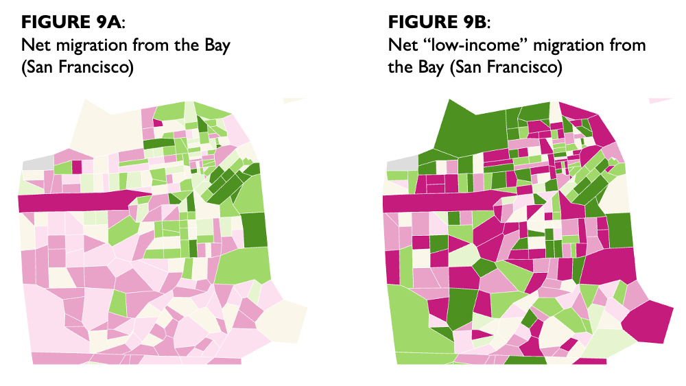
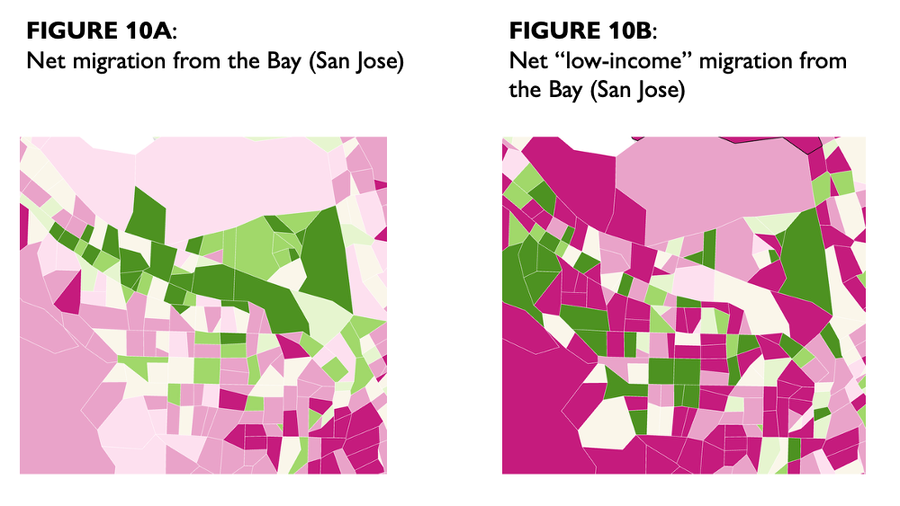
Figures 8A and 8B show net migration to/from the Bay at the tract level since 2014. The left panel (Panel A) shows net migration per 100,000 residents, while the right panel (Panel B) focuses just on movers who we define as “low income.” Green represents net in-migration while pink represents net out-migration, with darker colors signifying more intense trends. In Panel A, many of the green-colored tracts are urban tracts with new housing developments, which accounts in many cases for the net in-migration. In contrast, many of the darker pink-colored tracts are in suburban areas that did not see as much new housing. Across California, average household sizes have declined 6.4% since 2015,13 so the overall trend is that exiting households are replaced with smaller households on average (vacancy rates were generally stable over this time period).
In Panel B, “low-income” migration tends to be more intensive (i.e., darker colors) in both directions. There appear to be distinct migration patterns for “low-income” residents, including in the urban cores like San Francisco (Figure 9), downtown San Jose/Santa Clara (Figure 10), and the flats of the inner East Bay (Richmond to Fremont). Because of the way we define “low income” (see note 11), some of these patterns may reflect migration by young people who are not well established financially but who do not necessarily have low earnings.
Most of the Bay’s largest cities lost “low-income” residents on net over the past dozen years (Table 4). In general, “low-income” residents left bayside East Bay cities at greater rates than they did from cities in the inland East Bay, the Peninsula, or the North Bay. Importantly, many of these cities also saw net out-migration of higher-income populations, sometimes in even greater numbers. As a result, in many cities, the share of “low-income” residents increased even while the number of “low-income” residents decreased.
Where are people moving to?
We turn now to the destinations of Bay Area residents who choose to move. Out of every 20 Bay Area movers, 11 stay within the same county, 4 move to another county within the Bay Area, 3 leave the state, and the remainder move elsewhere in California (Table 5). The share of Bay movers leaving the state has increased steadily over time, from 13% in 2014 to 16% in 2025.
Six percent of movers relocate to the Central Valley14 and another 4% move to the Los Angeles region.15 Movers from Solano County are nearly twice as likely to end up in the Central Valley as movers from other Bay counties. Movers from Sonoma County are 25% more likely to leave California than movers from other Bay counties.
The Bay Area continues to be an attractive locale for young people. Over the study period, more than 50,000 young people (ages 18-25) moved to the Bay on net. But when young people leave the Bay, they are more likely to leave the state now than in the past. In 2014, 14% of young Bay Area movers left the state, but that share increased to 23% by 2025.
The vast majority (75%) of “low-income” movers stay in the Bay Area. Those who do leave the Bay are more likely to move to the Central Valley (8% vs 5%) and less likely to move out of state (12% vs 15%) than are higher-income movers.
Move destinations also differ by race. White and American Indian/Alaska Native movers are more likely to leave the state than other groups. Black, Hispanic, and American Indian/Alaska Native movers are more likely to move to the Central Valley. And Asian/Pacific Islander movers are more likely to move within the Bay.
The racial composition of destination neighborhoods differ substantially from those movers left, particularly for those who exit the state. Former Bay Area residents who leave California tend to arrive in neighborhoods whose residents are 45% more likely to be White (63% vs 43%; Figure 11). Those who relocate within California also arrive in neighborhoods with more White residents.
Conclusion
The Bay Area’s high cost of living, particularly in housing, is a likely factor driving recent relocation trends. Residents who leave the region typically secure more affordable housing, though they may trade off lower incomes and other neighborhood amenities, such as school quality or environmental safety. Out-movers leave from a wide variety of communities, which reflect the Bay on average, but movers usually exhibit greater financial vulnerability than their neighbors, such as higher debt and lower credit scores. Within a few years of moving, they are much more likely to own a home.
Beyond economic factors, the Bay Area is experiencing a notable demographic evolution, marked by increasing racial diversity as migration flows shift. Although the COVID-19 pandemic triggered substantial exits from urban hubs like San Francisco, recent data points to a stabilization, or even a resurgence, as people gravitate back toward those same areas.
Acknowledgments
This project was supported by Tipping Point Community. We also thank other supporters of the California Policy Lab, including The James Irvine Foundation, the University of California Office of the President, and the Woven Foundation.
About the Data: The University of California Consumer Credit Panel (UC-CCP) is a dataset of anonymized consumer credit information, created for the purpose of studying consumer financial well-being and identifying trends among California households related to credit, debt, income, and mobility, including through the California Credit Dashboard. The data are currently in use for dozens of projects that inform research on a variety of topics including economic mobility, health and financial well-being, the impact of student debt, California’s housing challenges, and more.
Suggested Citation: Fischer, B., & White, E., (2026). Priced Out of the Bay. California Policy Lab, University of California. https://capolicylab.org/priced-out-of-the-bay/.
Appendix
ENDNOTES
- We measure domestic migration only, not other components of population change like births, deaths, or international immigration. ↩︎
- We use the 9-county Bay Area definition: Alameda, Contra Costa, Marin, Napa, San Francisco, San Mateo, Santa Clara, Solano, and Sonoma. ↩︎
- AAA 2026. ↩︎
- Census Pulse Survey 2023. ↩︎
- Bureau of Labor Statistics 2026. Authors’ analysis of SF metro and US city average prices 2016-24 for electricity and piped gas prices. Assumes electricity is two-thirds of the total utility bill. ↩︎
- MTC 2026. ↩︎
- Bureau of Economic Analysis 2026. ↩︎
- California Association of Realtors 2026; National Association of Realtors 2026. According to the California Credit Dashboard, the average mortgage origination in the Bay over the past year averaged $872,000, compared to a California average of $678,000. ↩︎
- Our measure of homeownership is a probabilistic estimate that accounts for whether the person has an open mortgage or home-related loan or line of credit over the last 20 years; whether the person lives in a multi-unit dwelling; and the baseline rate of homeownership among that person’s age group in that person’s PUMS area. Our measure systematically underestimates the rate of homeownership but is reliable in spotting trends, as we do here. ↩︎
- LAO 2026, showing only 9% of workers (in California and nationally) do their work fully remote. ↩︎
- In describing racial and ethnic identity, we are limited to the categories that are provided to us in the UC-CCP, which uses the Bayesian Improved Surname and Geography methodology (RAND 2009) to estimate the likelihood that each person is one of six mutually exclusive racial/ethnic categories: Hispanic, and non-Hispanic White, Black, Asian/Pacific Islander, American Indian or Alaska Native, and Multiracial/other races. ↩︎
- We do not directly observe income in the credit data. Instead, we proxy for “low income” if the person meets two of three criteria: has less than a 10% chance of being a homeowner (see note 8); has a credit score under 620; and has a credit limit of less than $5,000 alongside credit utilization over 50%. Most of those identified as “low income” using this measure meet the first two criteria, which may inadvertently capture some young people who have higher incomes but a blemished credit history. Using this method, approximately 23% of people in our data are identified as low income. ↩︎
- CPL analysis of Department of Finance Tables E-5 and E-8, showing the average household size declined 6.4% between 2015 and 2025. ↩︎
- We define the Central Valley as encompassing 3 economic regions: San Joaquin Valley, Greater Sacramento, and Northern Sacramento Valley. These three regions include the following counties: Butte, Colusa, El Dorado, Fresno, Glenn, Kern, Kings, Madera, Merced, Placer, Sacramento, San Joaquin, Shasta, Stanislaus, Sutter, Tehama, Tulare, Yolo, and Yuba. ↩︎
- We use the 5-county definition for the Los Angeles region: Los Angeles, Orange, Riverside, San Bernardino, and Ventura. ↩︎