
Executive Summary
Financial instability is a leading driver of homelessness, and recent research has found that temporary financial assistance, targeted to at-risk households, reduces entries into homelessness. In 2021, the nonprofit All Home convened a working group to develop a Bay Area homelessness prevention model and assessment tool to target resources to those at highest risk of homelessness. All Home partnered with Bay Area Community Services (BACS), a nonprofit service provider, to build the Homelessness Prevention Platform (HPP), an online application management platform.
This report uses data from about 55,000 HPP applications to describe who applies for prevention services and who receives assistance in six Bay Area jurisdictions (the City of Oakland, and San Francisco, Contra Costa, Napa, Solano, and Sonoma Counties). The report is part of a broader evaluation of the Bay Area’s regional homelessness prevention model that is being conducted by the California Policy Lab.
Key findings:
- About 55,000 applications were submitted to the HPP between May 2021 and July 2025. Each applicant completed an online risk screener intended to identify households at greatest risk of becoming homeless. Of the submitted applications, 61% were marked as prioritized, meaning they received a risk score above a threshold or had experienced homelessness in the last two years.
- Applicants are highly cost-burdened, and about half have a history of homelessness. More than eight in ten applicants have incomes under 30% of the area median income, a majority spend more than half of their income on housing costs, and nearly half have experienced homelessness in the past.
- The households that apply to prevention programs differ from the general population of low-income and high-rent-burden households. Compared to renter households with high rent burdens and low incomes in the same jurisdictions, prevention applicants are more likely to identify as Black and to be working-age adults aged 25–60.
- Certain groups of applicants are more likely to meet the criteria to be prioritized for services and to receive services. Black applicants, Transition-Aged Youth (TAY), and applicants with children in the household are more likely to be prioritized compared to other groups, either because they score above a threshold on the risk screener or had recently experienced homelessness.
Introduction
In the San Francisco Bay Area, more than 75,000 people enrolled in homelessness assistance programs in fiscal year 2023–24.1 Just under half (46%) were experiencing homelessness for the first time (Amaral 2025). Around the country, cities and counties have begun investing in homelessness prevention, which typically pairs direct financial assistance with light support and legal services, to support people at risk of homelessness. Evidence from other models shows that many people who apply for prevention services and appear at high risk will avoid homelessness even without support (Phillips and Sullivan 2025; Evans et al. 2016). Therefore, it is important for these programs to identify and serve households at highest risk in order to have the biggest impact.
In 2021, the regional nonprofit All Home convened a working group to develop a Bay Area homelessness prevention model and assessment tool to target resources to those at highest risk of homelessness. All Home partnered with Bay Area Community Services (BACS), a nonprofit service provider, to build the Homelessness Prevention Platform (HPP), an online portal that people can use to apply for prevention services. All Home has invested over $12 million in local prevention programs to date.
To measure impact, All Home contracted with the California Policy Lab (CPL), a nonpartisan research center at the University of California, to conduct an independent evaluation of the Bay Area’s regional model. The evaluation will assess the causal impact of the model on homelessness in the Bay Area — adding to an evidence base that includes a randomized control trial in Santa Clara County that found that temporary financial assistance reduced entries into homelessness (Phillips and Sullivan 2025).
All Home is a Bay Area nonprofit established in 2019 to disrupt the cycles of poverty and homelessness by advancing regional, coordinated, and innovative solutions. The organization has made significant investments in helping grow homelessness prevention programs throughout the region.
As part of an initial phase of the evaluation, this report uses data from about 55,000 HPP applications to describe who applies for prevention services and who receives assistance in six Bay Area jurisdictions. The report begins by providing a brief overview of the Bay Area’s targeted prevention model, then outlines the general flow of applications through the programs. In later sections, the report describes the demographics and other characteristics of applicants at each stage of the program: application, prioritization, and payment.
I. Background on the targeted prevention model
The regional homelessness prevention model designed by All Home, BACS, and their partners is designed to identify households vulnerable to homelessness and keep them housed through one-time financial assistance and other services. In order to target this assistance to households at highest risk, the application process includes both an eligibility screen and a risk screening tool to prioritize the households most likely to enter homelessness without assistance. Programs based on the model currently operate in Contra Costa County, Oakland, San Francisco, Solano County, and Sonoma County. In addition, Napa County operated a program between January and October 2023.2
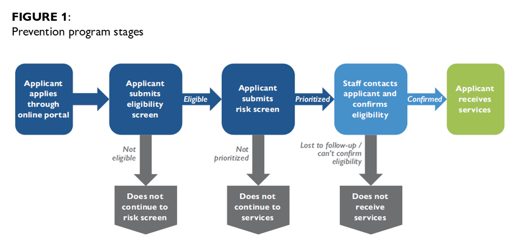
Across these programs, a household applying for assistance goes through the same process — application, eligibility screen, risk screen, and working with case workers to confirm eligibility and determine which services are appropriate — before receiving support (see box and Figure 1).
Prevention program stages
- Application: Households apply through the HPP, an online portal managed by BACS. They may work with a community group contracted by the program to assist applicants with the online application and conduct outreach.
- Screening for eligibility: The first page of the application screens for eligibility. Applicants are ineligible if they report an income above 50% of the area median income (AMI), live outside of the program jurisdiction, or do not report a recent hardship.3 Ineligible applicants are screened out and do not continue to the full application.
- Screening for risk to prioritize high-risk households: The full application includes a risk screener of 14 to 20 items, with slight variation based on local priorities. The screener assigns points for factors that are associated with a higher likelihood of future homelessness, such as living without a lease or having a disabling condition. Applicants whose score is above a threshold score are “prioritized” and informed that they can receive services from the program. Applicants who report that they have experienced homelessness in the last two years are automatically prioritized regardless of their score.
- Confirming eligibility and providing services: Case workers attempt to contact the prioritized households using contact information provided in the application. Once they make contact, they confirm the household’s eligibility for the program and collect documentation. Case workers then determine what type of support and how much aid each household receives on a case-by-case basis. Rental or utility funds are paid to the landlord or utility company, unless there are extenuating circumstances.
There are some differences among the programs using this model. Each local program sets their own threshold prioritization score, and they can change their threshold scores over time in order to control the volume of prioritized applicants or in response to changes in funding availability. While the content of the screener is broadly similar across programs, there are differences in the specific questions and how they are scored. For example, the San Francisco program gives points to applicants who report they have been “pressured to move out,” while other programs give points only if applicants report they have received a past-due rent notice or unlawful detainer.
The types of services available also depend on the program. Every program provides back rent for households who have fallen behind on rent payments, and some also offer other financial assistance such as utility assistance, move-in assistance, limited amounts of forward rent, or flexible funds for expenses like gas or car repairs. Most of the programs also provide non-monetary services such as benefit navigation, housing search assistance, and budgeting help.
Data sources
- Homelessness Prevention Platform (HPP): Application and service data from the application portal maintained by BACS between May 27, 2021, and July 31, 2025. This data includes information about the applicant household, including demographics, household composition, priority screener questions such as history of homelessness or whether the household is living without a lease. It also includes information about whether the household was prioritized for service and the financial services each applicant received. Most programs that use the HPP do not consistently track non-monetary services in the system.
- American Community Survey (ACS): We use the 2023 American Community Survey 5-year sample4 to estimate the demographics of the general population of households at risk of homelessness in each jurisdiction. The ACS is a representative survey conducted by the U.S. Census Bureau. We define households “at risk of homelessness” in the ACS as renter households with incomes of less than 50% AMI and rent burdens of more than 50%.5
II. Program stages by the numbers: eligibility, prioritization, and payment
This section describes the volume of applications that reach each of the following three stages of prevention programs: eligibility, prioritization, and payment. We first describe application flow in all six programs combined, then describe some differences among the programs operating in each jurisdiction.
A. Application flow across all programs
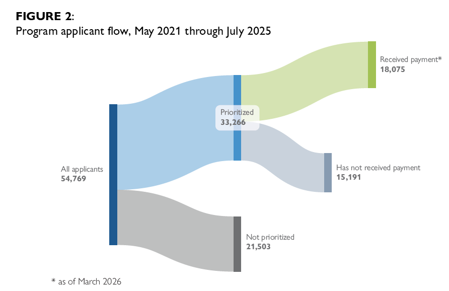
About 55,000 applications were submitted to homelessness prevention programs in this network between May 2021 and July 2025 (Figure 2). This number includes only applications that met basic eligibility requirements (AMI, geography, and recent experience of a hardship) at the time of applying. The HPP application screens out ineligible applicants before they submit a full application, so we do not have data about households who attempted to apply but were not eligible.6 This number also excludes a small number of applicants who did not consent to participate in research (these applicants were still eligible for the program) and duplicate applications identified by the programs.
Of the submitted applications, 61% were marked as prioritized, meaning that they received a risk score above the threshold or recently experienced homelessness and could receive services through the program. Of those prioritized applications, 54% had received financial assistance at the time the data was exported for analysis in March 2026.7 The rate of payment for applications submitted between January and July 2025 (46%) is lower than in earlier years (57% in both 2023 and 2024).
About a fifth of applicants (21%) reported that they experienced homelessness in the past two years, meaning that they were automatically prioritized for services. These recently homeless applicants make up more than a third (36%) of all prioritized applicants. Most would have been prioritized regardless: 84% had a priority score above or equal to the program’s threshold score at the time they applied.
B. Differences in applicant flow among programs
Most of the applications into the HPP are from the San Francisco program, which has operated for the longest time and has the highest average volume of applicants (Table 1). The differences in program scale are likely due to a mix of factors, including funding availability and the social service ecosystem in San Francisco.
TABLE 1: Program Details
| PROGRAM | APPLICATION DATES | NUMBER OF APPLICATIONS | AVERAGE APPLICATIONS PER MONTH | NUMBER OF PRIORITIZED APPLICATIONS |
|---|---|---|---|---|
| Contra Costa County | Dec. 2023 through Jul. 2025 | 2,035 | 102 | 958 |
| Napa County | Jan. 2023 through Oct. 2023 | 299 | 30 | 230 |
| Oakland | Jul. 2021 through Jul. 2025 | 5,856 | 120 | 3,873 |
| San Francisco | May 2021 through Jul. 2025 | 42,788 | 855 | 26,627 |
| Solano County | Nov. 2024 through Jul. 2025 | 2,390 | 286 | 991 |
| Sonoma County | Dec. 2024 through Jul. 2025 | 1,401 | 189 | 587 |
Across the six programs, the applicants’ median score on the risk screener is relatively similar, with a range of 6 to 9 out of a possible 27–34 points (Figure 3).8 The share of applicants who are prioritized to receive assistance varies across programs. More than three-quarters of applicants in Napa County were prioritized, while about four in ten were prioritized in Solano and Sonoma Counties (Figure 4).
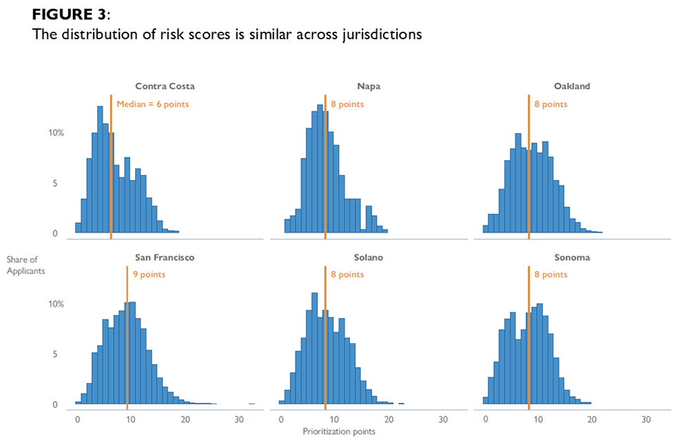
The major factor influencing how many applicants are prioritized is the threshold score for each program, which is set based on each program’s available funding. This threshold can be altered over time in each jurisdiction as funding availability fluctuates relative to applications. For instance, Sonoma and Solano County have relatively high threshold scores (11 or 12) and the lowest proportion of prioritized applicants, while Napa had the lowest threshold score and the highest prioritization rate. This pattern is also visible when programs change their threshold score. As one example, when San Francisco changed its threshold score from 8 to 10 in September of 2023, the percentage of applicants who were prioritized decreased from 73% in the two months before the change to 60% after the change.
It should be noted that the COVID-19 pandemic had a significant influence on early program designs and funding availability. The government response to the pandemic provided an influx of funding for rental assistance at the same time that many low-income households lost jobs and income. Oakland and San Francisco programs faced a very different policy environment in 2021 — with high demand and more funds available — than they did in more recent years.
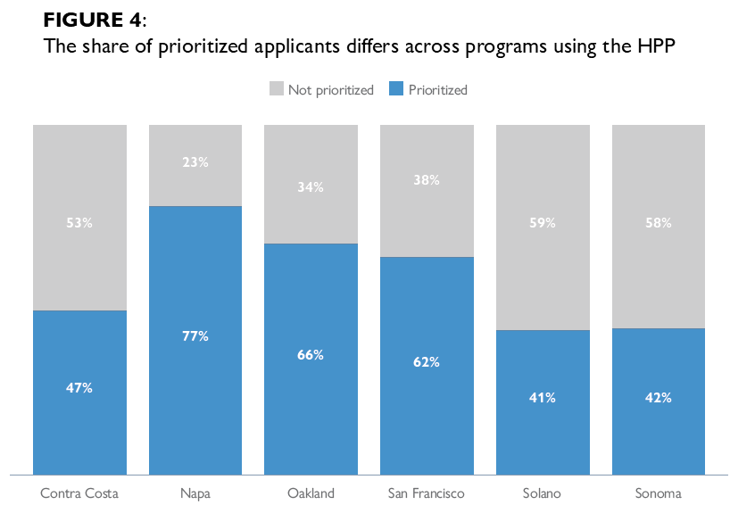
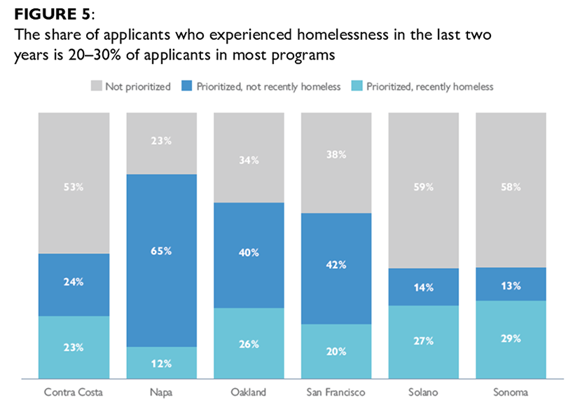
Figure 5 shows applicants with a recent experience of homelessness (in the two years prior to applying) make up between 20 and 30% of applicants across programs, except for Napa County. They make up a majority of prioritized applicants in the Solano and Sonoma programs.
III. Who applies to the prevention programs?
The Bay Area’s regional prevention model is intended to target households at greatest risk of homelessness. At each stage, program decisions impact which households receive assistance: at the application stage, by conducting outreach to communities at risk and setting eligibility criteria; at the prioritization stage, by designing the prioritization screener and setting points thresholds; and at the services stage, by implementing effective processes for contacting applicants and providing timely services.
The remaining sections of this report describe the characteristics of applicants at each stage, starting with the applicants who applied for assistance through the homelessness prevention programs that use the HPP. This section also compares the characteristics of applicants to the general population of renters in that area who are vulnerable to homelessness. We generally focus on the characteristics of applicants across all the programs, except for cases where there are notable differences between jurisdictions.
The application portal collects the race/ethnicity and gender of the individual filling out the application, as well as the ages of other household members and household information such as income and rent burden. We refer to the individual who filled out the application as the “applicant,” and specify in cases where we are referring to other household members.
A. Applicant characteristics
Most applicants are working-age adults on the younger side. Figure 6 shows about half (50%) of all applicants are adults between the ages of 25 and 44. Fifteen percent are seniors 62 and older. Three percent are Transition-Aged Youth aged 18 to 24 (TAY), though a larger share of applicants (15%) reported that there is one or more TAY in their household.9
A majority of applicants are women. Table 2 shows almost six in ten (57%) applicants are women, while 36% are men and 3% have another gender identity. Working-age women aged 25 to 61 make up nearly half of all applicants (48%).
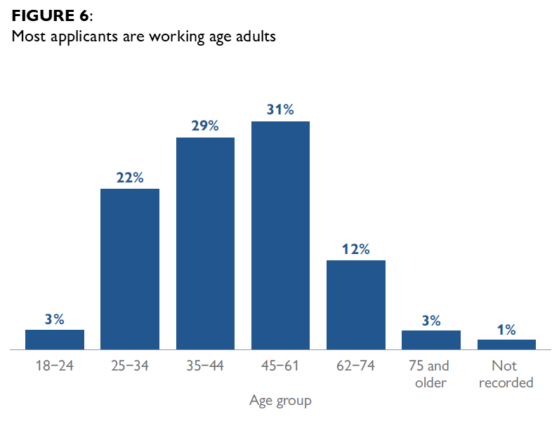
TABLE 2: Most applicants are women
| GENDER IDENTITY | PERCENT OF APPLICANTS |
|---|---|
| Woman | 57% |
| Man | 36% |
| Transgender, genderqueer/nonbinary, questioning, culturally specific, or different identity | 3% |
| No response | 5% |
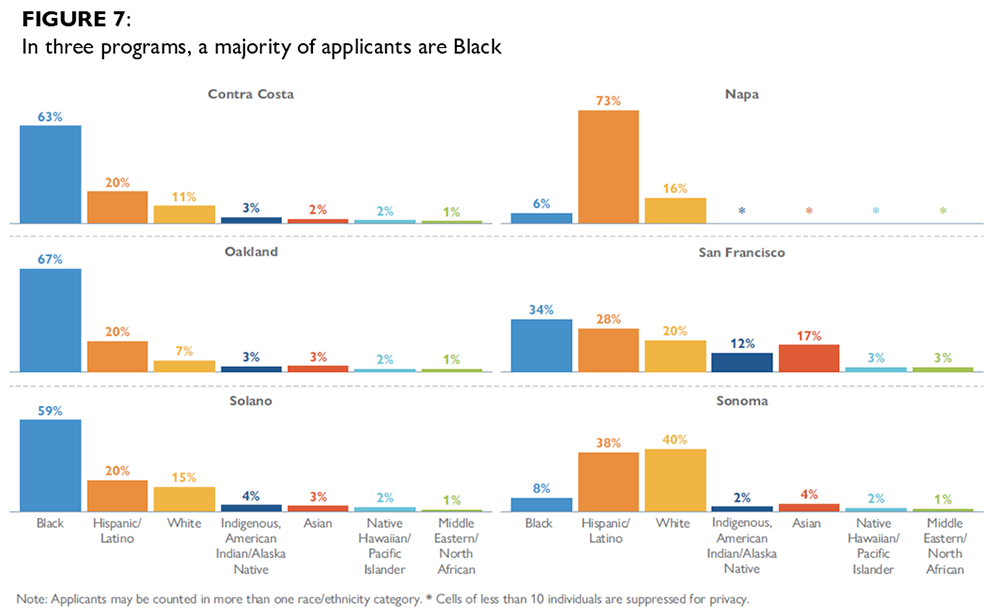
Racial and ethnic breakdowns vary by program. Four in ten applicants identified as Black, while about a quarter identified as Hispanic or Latino and two in ten as White.10 However, there are notable differences among the programs (Figure 7). The majority of applicants are Black in Oakland, Contra Costa County, and Solano County (59–67%), while most applicants in Napa County and Sonoma County either identify as Hispanic or Latino or as White. In San Francisco, applicants are most commonly Black (34%), Hispanic or Latino (28%), or White (20%), but substantial proportions are Asian (17%) or Indigenous, American Indian, or Alaska Native (12%).11
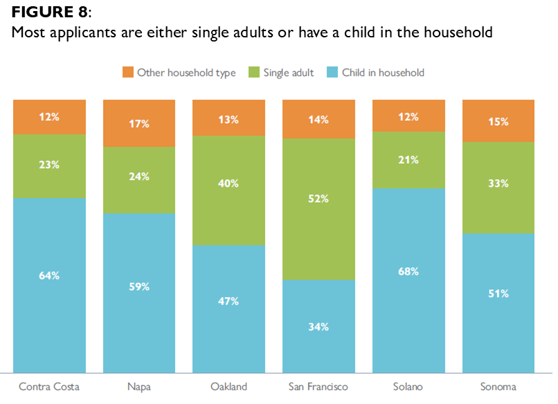
Applicants tend to either be single adults or have children in the household. About four in ten applicants have one or more children (39%), while 47% reported that they live alone. The remaining 14% live in a household with other adults. Women are far more likely to be in a household with children: 52% of women applicants reported that they have a child, while a majority (65%) of male applicants are single adults.
There are differences across programs, however: applicants in Contra Costa, Napa, and Solano are especially likely to have children in the household (59–68% of applicants; Figure 8), while applicants in San Francisco are less likely to have children (34%) and more likely to live alone (52%). San Francisco applicants also tend to be older than applicants in other programs, and a larger share are men.12
Applicants are highly cost-burdened and half have a history of homelessness. More than eight in ten (83%) applicants have extremely low incomes (under 30% of the area median income), and more than half (56%) are severely cost-burdened, meaning they spend more than 50% of their income on housing costs. About half (48%) of applicants reported that they have previously experienced homelessness and one in five (22%) said they have been homeless in the last two years.
B. Comparison between applicants and vulnerable renter households
This section compares the characteristics of prevention program applicants to the general population of households who are vulnerable to homelessness in those areas. We use American Community Survey data to estimate the characteristics of these comparison households in the jurisdictions where prevention programs are located, defining a household as “vulnerable renters” if they rent their home, have an AMI of 50% or less, and spend more than 50% of their income on rent.
Interpreting comparisons between applicants and vulnerable renter households. This comparison can help illuminate how well the applicant pool represents people in the community who may need prevention services. However, demographic differences in these comparisons should not necessarily be interpreted as the program creating these differences. ACS data does not include many factors — such as past experiences of homelessness — that correlate with risk of future homelessness and make it more likely that a household will apply for a homelessness prevention program (Gendening and Shinn, 2017). These unmeasured differences may contribute to the demographic differences in these comparisons.
As an example, Black households are more likely to have past experiences of homelessness in the general population, which correlates to a higher risk of future homelessness, and presumably a higher likelihood of applying to a prevention program. This may explain why households headed by Black people are more represented among applicants than the vulnerable renter population at large.
Applicants are more likely to have children in their household than vulnerable renters. Slightly less than a third (30%) of vulnerable households in the community have one or more children, compared to 39% of applicants. Vulnerable households are also more likely to be headed by men (43%) than applicant households (36%).13
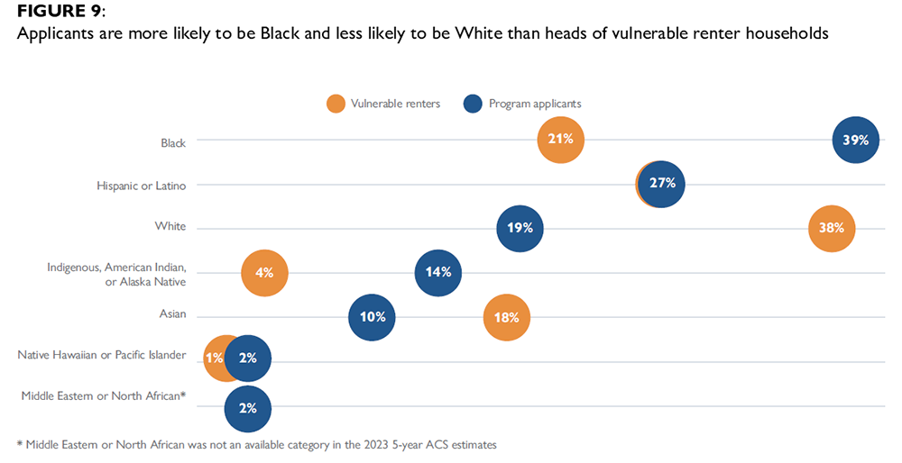
Applicants are more likely to be Black compared to heads of vulnerable renter households. Black heads of household make up 39% of applicants, but 21% of vulnerable renters (Figure 9). At the same time, applicants are less likely to be White compared to vulnerable renter households (19% vs 38%). However, there are some differences by jurisdiction. In Oakland, Solano County and Contra Costa County, applicants are less likely to be Hispanic or Latino. In San Francisco, applicants are more likely to identify as Indigenous, American Indian, or Alaska Native14 and Hispanic or Latino, and are less likely to be Asian compared to households vulnerable to homelessness. A full table of comparisons by jurisdiction is available in Appendix A.
There are many potential reasons for these differences. There may be under-representation of Asian and Hispanic or Latino communities in the prevention programs due to barriers to application, such as language, lack of knowledge, stigma, or fear of government services for immigration reasons. There may also be differences in access due to structural factors like the location of services or preexisting connections to agencies that refer households to these services. The higher proportion of Black (and in San Francisco, Indigenous, American Indian, or Alaska Native) applicants may reflect a higher risk of homelessness in these communities that is not fully captured by rent or income data — for instance, differences in their access to wealth or a family safety net. This heightened risk may explain why Black households are more likely to apply for homelessness prevention services.
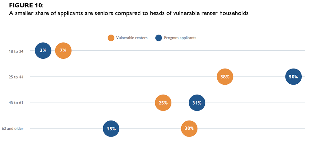
Applicants are less likely to be seniors. Three in ten (30%) households vulnerable to homelessness are headed by people 62 or older, compared to 15% of applicants (Figure 10). There are also fewer TAY-headed households among applicants: 7% of vulnerable renter households are headed by adults under 25, while 3% of applicants are adults under 25.15
IV. Who is prioritized by the prevention programs?
This section describes the applicants who meet the criteria to be prioritized by the prevention programs, either because their score on the risk screener was higher than the threshold, or because they experienced homelessness in the last two years. We describe the general profile of all prioritized applicants, as well as the characteristics of applicants who were automatically prioritized because they had recently experienced homelessness. We then describe specific demographic groups who are more or less likely to have been prioritized for services.
Interpreting comparisons between applicants and prioritized applicants. Findings in this section are descriptive, and differences among different demographic groups do not necessarily mean that All Home’s risk screener creates bias. The factors in the risk screener — such as past history of homelessness or having young children in the household — are more common among some demographic groups than others, which can create differences in the likelihood of being prioritized by the risk screener among different groups.
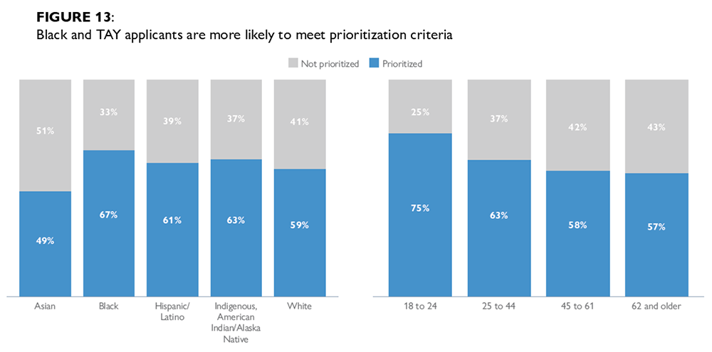
As an example, TAY applicants are more likely to be prioritized than applicants 25 and older (75% were prioritized, vs 60% of other age groups). But this is partially explained by the fact that TAY applicants were especially likely to have experienced homelessness in the past two years (44% did), meaning that many were automatically prioritized.
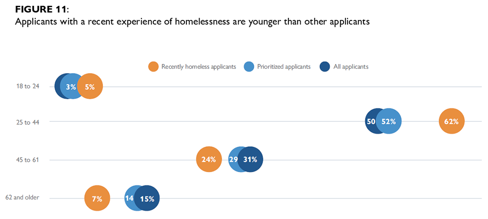
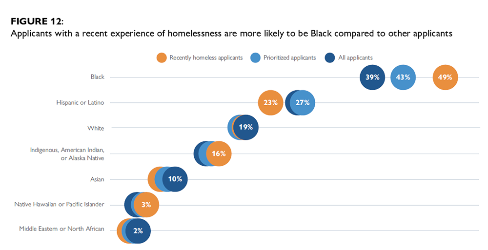
Applicants who met the criteria to be prioritized for services are demographically similar to the entire applicant pool. Prioritized applicants are mostly women (57%, same as all applicants), and most are between the ages of 25 and 44 (52% vs 50% of all applicants; Figure 11). A plurality (43%) of prioritized applicants are Black (vs 39% of all applicants), and about a quarter (27%) are Hispanic or Latino, same as all applicants; Figure 12).
Applicants who recently experienced homelessness have a distinct profile. These applicants are younger on average than other prioritized applicants: more than six in ten (62%) are between the ages of 25 and 44, and an additional 5% are TAY under the age of 25 (Figure 11).
About half of recently homeless applicants are Black (49%; Figure 12), compared to 39% of prioritized applicants without a recent history of homelessness. Recently homeless applicants are also slightly more likely to be single adults living alone without children (51%).
Black applicants, TAY applicants, and families with children are more likely to meet the criteria to be prioritized compared to other groups. About six in ten (62%) of all applicants were prioritized to receive services, meaning that they scored above the threshold on the program’s risk screener or had experienced homelessness in the last two years. Black and TAY applicants were more likely to meet this criteria: about two-thirds (67%) of Black applicants and 75% of TAY applicants were prioritized (Figure 13).16 Asian applicants were less likely to have met prioritization criteria (49%) than other racial or ethnic groups. Applicants with children in the household met prioritization criteria more often than those without children: 66% were prioritized, while 58% of households without children were prioritized. Having children or a senior in the household adds prioritization points across all programs, and having a TAY head of household adds points in San Francisco and Napa County.
V. Who receives payment from the prevention programs?
This section describes who receives payment from the programs after being prioritized.17 While every prioritized applicant is eligible for financial assistance, there are a variety of reasons why they may not receive it. For example, some applicants no longer need assistance once they are contacted; contact information becomes outdated; people move out of the area; or they do not respond to follow-up from the program at a stressful and difficult time in their lives. Applicants who are more difficult to contact may be less likely to receive payment from the program. Prior CPL research on the Los Angeles County Homelessness Prevention Unit found that this type of outreach to vulnerable people is highly challenging (Blackwell et al. 2025).
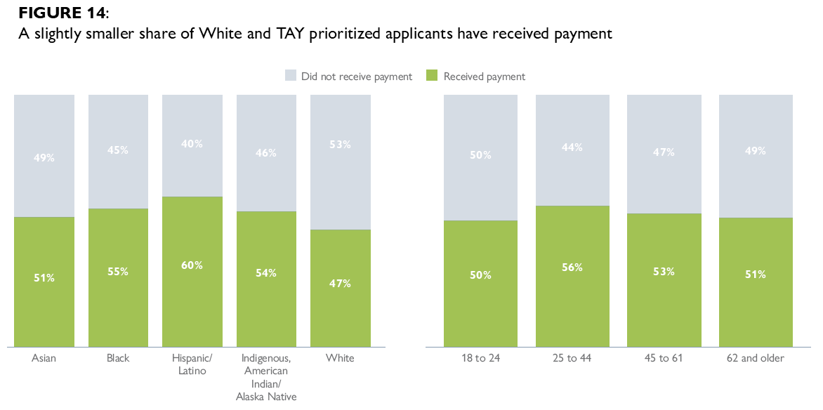
There are relatively small differences in who receives payment after being prioritized. About half of prioritized applicants had received payment at the time the data was exported, about seven months after the most recently submitted application included in this analysis.18 Figure 14 shows that a slightly smaller share of White applicants (47%) and TAY applicants (44%) had received payment, while a larger share of Hispanic prioritized applicants (60%) had received payment.
Taking both the prioritization and payment stages into account, Black and Hispanic applicants, TAY applicants, and families with children are among the most likely to receive payment out of all applicants (37–38%, compared to 33% overall).
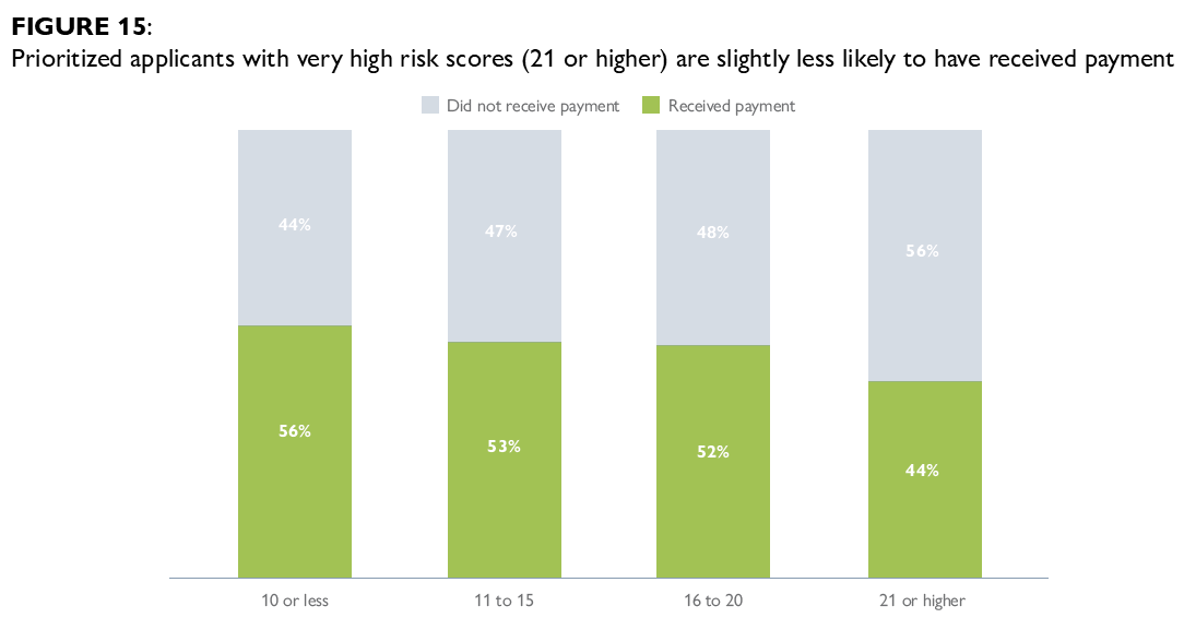
Prioritized applicants with the highest prioritization points are slightly less likely to have received payment than those with lower prioritization points. Forty-four percent of those scoring 21 points or more on the screening tool have received payment, compared to a little over half of prioritized applicants at other prioritization point scores (Figure 15). This difference may point to barriers faced by people at higher risk, or a higher likelihood that they have already lost their housing by the time their application was processed. However, the number of people with scores above 20 during this entire study period is small, representing less than 1% of prioritized applicants (n = 96).
In a few programs, applicants with a recent experience of homelessness were less likely to receive payment than other prioritized applicants. In Oakland and Sonoma, applicants with a recent experience of homelessness were less likely to receive payment than other prioritized applicants: 37% vs 55% in Oakland and 34% vs 44% in Sonoma. These differences may also point to these applicants being more vulnerable and harder to contact. There were minimal differences in the other four programs.
Conclusion
Since 2021, the six programs using the Bay Area prevention model have received about 55,000 applications and have provided financial assistance to more than 18,000 applicants. Black applicants, TAY applicants, and families with children are more likely to meet the criteria to be prioritized for services than other demographic groups. Hispanic applicants are slightly more likely to receive payment. Taking both the prioritization and payment stages into account, Black and Hispanic applicants, TAY applicants, and families with children are among the most likely to receive payment out of all applicants.
In interpreting these results, it is important to consider the extent to which they reflect differences in the underlying risk of homelessness. For instance, Black people in the United States are about five times as likely to experience homelessness as White people (National Alliance to End Homelessness), and this heightened vulnerability may be reflected in the higher number of Black households who apply to these programs and who are prioritized by the risk screener. However, other differences may be more a question of program design. A relatively high share of applicants are women with children in the household — but the majority of people experiencing homelessness in the United States are adults without children, and most are men (2024 Annual Homelessness Assessment Report).
This report is part of CPL’s evaluation of regional homelessness prevention programs that use the HPP in the Bay Area. A second phase of the evaluation is currently underway and will analyze the causal impact of the programs on reducing homelessness. It will assess the effects of the model overall using a quasi-experimental design. The evaluation will also explore how the effects of the model vary across participating jurisdictions and for key subgroups of applicants.
For more information about All Home’s support of homelessness prevention programs, please visit the All Home website or contact Irene Farnsworth, Director of Regional Homelessness Prevention (ifarnsworth@allhomeca.org). For questions about this research, please contact Zoe Klingmann (zokling@ucla.edu).
Acknowledgments
Funding for this research was provided by All Home and the Chan Zuckerberg Initiative. We also thank supporters of the California Policy Lab including The James Irvine Foundation and the Woven Foundation. This publication reflects the views of the authors and not necessarily the views of our funders. All opinions and errors should be attributed entirely to the authors.
Suggested Citation: Klingmann, Z., Gross, M., (2026). Serving Highest Needs: An Equity Analysis of Bay Area Homelessness Prevention Programs. California Policy Lab, University of California. https://capolicylab.org/serving-highest-needs-an-equity-analysis-of-bay-area-homelessness-prevention-programs/
Appendix A: Race and Ethnicity by Program
TABLE A1: Race and ethnicity by program
| JURISDICTION / GROUP | BLACK (%) | HISPANIC / LATINO (%) | WHITE (%) | INDIGENOUS, AMERICAN INDIAN / ALASKA NATIVE (%) | ASIAN (%) | NATIVE HAWAIIAN / PACIFIC ISLANDER (%) | MIDDLE EASTERN / NORTH AFRICAN (%) |
|---|---|---|---|---|---|---|---|
| Contra Costa County | |||||||
| Program applicants | 63 | 20 | 11 | 3 | 2 | 2 | 1 |
| Vulnerable renters | 23 | 31 | 36 | 4 | 15 | 1 | ** |
| Napa County | |||||||
| Program applicants | 6 | 73 | 16 | * | * | * | * |
| Vulnerable renters | 2 | 42 | 51 | 3 | 6 | 1 | ** |
| Oakland | |||||||
| Program applicants | 67 | 20 | 7 | 3 | 3 | 2 | 1 |
| Vulnerable renters | 37 | 24 | 24 | 4 | 18 | 1 | ** |
| San Francisco | |||||||
| Program applicants | 34 | 28 | 20 | 12 | 17 | 3 | 3 |
| Vulnerable renters | 11 | 20 | 42 | 3 | 31 | 1 | ** |
| Solano County | |||||||
| Program applicants | 59 | 20 | 15 | 4 | 3 | 2 | 1 |
| Vulnerable renters | 29 | 28 | 36 | 3 | 10 | 1 | ** |
| Sonoma County | |||||||
| Program applicants | 8 | 38 | 40 | 2 | 4 | 2 | 1 |
| Vulnerable renters | 5 | 34 | 59 | 5 | 6 | 1 | ** |
Note: Applicants may be counted in more than one race/ethnicity category. *Cells of less than 10 individuals are suppressed for privacy ** The Middle Eastern/North African category was not an available category in the 2023 5-year ACS estimates
ENDNOTES
- This data uses the nine-county Bay Area definition: Alameda, Contra Costa, Marin, Napa, San Francisco, San Mateo, Santa Clara, Solano, and Sonoma. ↩︎
- A similar targeted prevention program has operated in Santa Clara County since 2017, but it uses a slightly different screening model and is not included in this analysis. ↩︎
- The income eligibility threshold is 50% AMI in most jurisdictions; the threshold is 55% AMI in Oakland and was 80% AMI in San Francisco prior to 2023. Applicants for move-in assistance in San Francisco are not required to report a recent hardship. ↩︎
- The 2023 sample was the most recent microdata sample available at the time of analysis. It includes data collected between 2019 and 2023. There are two limitations of using the 2023 sample for this analysis: (1) the ACS data do not overlap with the date range of HPP applications in three of the six jurisdictions (see Table 1 for the application date ranges), and (2) the ACS data includes information collected during the COVID-19 pandemic, which may have impacted program funding availability, incomes, and rent burden. ↩︎
- This definition draws from Reid (2021). ↩︎
- The eligibility screen includes some tolerance to account for applicant error, so this number includes a small number of people with incomes slightly above the threshold. If these applicants are prioritized for services, a case worker verifies eligibility before providing services. ↩︎
- An additional 5,941 applicants received payment despite their prioritization score not reaching the threshold score, meaning that a total of 24,016 people (44% of all applicants) received payment. Eighty-three percent of the cases where a participant was not prioritized but did receive payment were processed through the San Francisco program prior to 2023 and were likely related to the response to the COVID-19 pandemic. ↩︎
- Because San Francisco and Napa have more points available in their risk screeners (34 and 29, respectively, compared to 27 in other programs), this is not exactly an apples-to-apples comparison. ↩︎
- Application data from Napa County did not include age information, so Napa applicants are not included in age analyses throughout this report. Napa applicants make up less than 1% of all applicants (n = 299). ↩︎
- Reported racial categories are not mutually exclusive, meaning that percentages may not add up to 100. Two of the six programs (Oakland and Napa) use a separate ethnicity question to ask about Hispanic/Latino identity; for those applicants, we combined Hispanic/Latino with the racial categories and counted people as Hispanic alone if they indicated that they are Hispanic in the ethnicity question and responded Decline to state, Other race or White to the race question in order to ensure comparability between jurisdictions. ↩︎
- San Francisco uses different wording for this category than other programs, which may contribute to this difference. They ask applicants whether they identify as “Indigenous/American Indian,” with subcategories that include “Indigenous from Mexico, the Caribbean, Central America or South America” as well as “American Indian/Native American.” The other programs use more limited terminology such as “American Indian or Alaska Native.” ↩︎
- These differences may be related to the fact that San Francisco’s program prioritizes applicants who live in their Permanent Supportive Housing units, who are predominantly single adults living alone. ↩︎
- The Census Bureau defines heads of household differently than the HPP application. In ACS data, the “householder” is the person in whose name the home is rented or owned — not necessarily the person filling out the survey. This could have an impact on the reported gender and race/ethnicity of the head of household. ↩︎
- As in the comparison above, San Francisco’s different racial and ethnic categories may contribute to this difference (see footnote 11). ↩︎
- However, applicants are about as likely to have a TAY as a member of their household (15% do, compared to 16% of vulnerable renter households). ↩︎
- As described above, TAY applicants were especially likely to experience homelessness in the last two years and thus be prioritized automatically. A similar pattern is true for Black applicants, 28% of whom experienced homelessness in the last two years. Asian applicants were slightly less likely to have recently experienced homelessness than non-Asian applicants. ↩︎
- This analysis does not include the 5,941 people who received payment through pathways other than All Home’s prioritization screener (see footnote 7). ↩︎
- The vast majority of payments are made within the first six months after application. ↩︎